For some time the planning profession and planning educators have shown concern about being too “white”. Our country continues to experience significant demographic changes, especially in terms of race and ethnicity, most notably becoming less “white”. The Planning Accreditation Board (PAB) has emphasized that planning programs should be racially diverse, which translates into being less “white” and/or more “non-white” – for the purposes of better representing the populations we serve. Regarding student diversity PAB language states:
“Student diversity: The Program shall adopt appropriate recruitment and retention strategies, including curricular strategies, to achieve its aspirations for a diverse student body, and shall document actual progress in implementing those strategies. The Program shall foster a climate of inclusivity that appreciates and celebrates cultural difference through its recruitment and retention of students. Students shall possess, in the aggregate, characteristics of diversity (e.g., racial and ethnic background) that reflect the practice settings where graduates work or where professional needs exist in the Program’s region of recruitment and placement. Notwithstanding, the demographic mix is not a static concept, and all planning programs should seek to be in the forefront of a diverse society.”
It can be argued that “racial and ethnic background” is a very narrow indicator of student diversity and should be reconsidered in light of the broader concept of diversity. Why don’t we include sexual orientation, political perspectives, socio-economic background, musical tastes, etc? Fostering inclusion involves self-identification which may be seen by some as potential for discrimination. As planning programs consider their relative student diversity (by PAB criteria), I thought it would be interesting to look at program-level metrics on race and ethnicity. According to PAB, of the nearly 5,000 students in accredited programs, 69.5% (full and part-time) are non-Hispanic white, which compares to 62.6% for the U.S.[1] In addition, these programs are 53% male and 47% female. So planning programs have some work to do. The aggregate numbers tell part of the story, and the question then becomes whether the unit of analysis is the discipline or individual programs.
Using the assumption that many programs draw from within and supply planners to their own states, I compared each program with the corresponding percentage of white residents in their state. Analyzing the race and ethnicity data for graduate students of ACSP member schools using the Guide to Undergraduate and Graduate Education in Planning (20th Edition). I selected the 96 member schools in the U.S. of which 84 provided complete data. This is admittedly a simplistic approach, however, I think it provides context for further discussion about program-level diversity. There is also the question whether the benchmark should be race-ethnicity at the national, state, regional, or workforce scale.
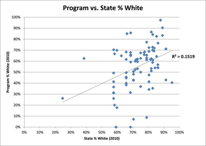
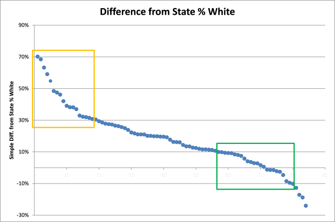
Figure 1 shows the weak correlation between state % white and program % white and Figure 2 shows the distribution of variance between state % white and program % white for the 84 programs included.
Figure 1
Figure 2
As mentioned, program demographics (% white only) is weakly correlated with state demographics (see Figure 1). This is because planning programs differ in the number of out of state students (including international students) enrolled, even for programs within the same state. Also evident are outliers like Historically Black Colleges and Universities (HBCUs) such as Alabama A&M, Texas Southern, and Jackson State; states with high proportions of white residents like Utah, Iowa, and Maine; and elite schools like Harvard, MIT, and Penn. The “orange zone” shown in Figure 2 includes planning programs with proportions of white students that vary from their state proportions by 30% or more. Based on “whiteness” these programs qualify as hyper-diverse. The results for this group are driven by having much lower percentages of white students compared to their state averages. Whether these 19 schools represent diversity is open to interpretation (see Table 1).
Table 1 – Orange zone programs
On the other hand, schools that fall into the “green zone” shown in Figure 2 are those within 10% absolute difference from their state proportion of white residents. These include the 23 schools shown in Table 2. It should be mentioned that the 30% and 10% thresholds were selected arbitrarily for illustrative purposes and aren’t related to any particular standards. In addition, based on the available data, only 5 of the 84 schools included had margins greater than 10% above their state averages (see Table 3).
Table 2 Green zone programs
Table 3 Below state level
The metrics are an obvious problem here. An appropriate measure would take into account representation across identified groups. Two schools, UCLA and UC Berkeley have students that represent all 8 categories used for reporting student race/ethnicity. Eight other schools represent 7 of the 8 categories. Overall, 56 of the 84 schools represent 4 of the 8 categories (see Figure 3). I’m not recommending this as a diversity measure, but instead using it for descriptive purposes.
Figure 3
In addition, a pressing issue that will be discussed in a follow-up blog post is planning faculty diversity. Data from the ACSP Guide show significant disparities with two-thirds of faculty being male and over 80% being white. This is the product of different dynamics that are being faced by institutions that will require concerted efforts to remedy.
Your comments are welcome.
[1] Source: U.S. Bureau of the Census, County Population Estimates by Demographic Characteristics – Age, Sex, Race, and Hispanic Origin; updated annually for states and counties. http://www.census.gov/popest/counties/asrh/. 2010 Census of Population and Housing for places; updated every 10 years. http://factfinder2.census.gov.


